Help Docs/Getting Started
Getting Started
Set up your account, define your first goal, and ship meaningful daily progress. This guide gets you to a clear plan in under 15 minutes.
What you will achieve
- Create a clear goal with a realistic timeframe.
- Break it into steps and daily actions.
- Set up reminders and optional calendar scheduling.
Before you start
- Set your time zone and working hours in Profile Settings.
- On Android, you can also install the Goaliath app from Google Play and sign in with the same account you use on desktop.
- If you sign in on a new phone or computer later, Goaliath may show a one-time prompt asking whether you want push notifications on that device too.
Step-by-step setup
- Profile and preferences: Open Profile Settings and set time zone, working hours, and notification email.
- Device reminders: If you want push on more than one phone or computer, sign in on each device and enable push there too. Goaliath supports multi-device push.
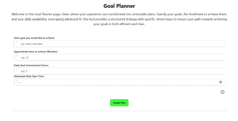
- Define a goal: Open Goal Planner and describe a specific, meaningful goal. Choose a timeframe and a daily time commitment.
- Review steps: Accept or edit the generated step sequence. Add your own steps if needed.
- Schedule actions: Add key steps to Today's Actions. Optionally sync to Calendar for time blocks.
- Daily check-in: Each morning, open Today's Actions, follow your script, and mark items done.
- Check the dashboard balance: The small Goal Balancewidget on the dashboard shows whether your total goal time for the current Monday-to-Sunday week is ahead, behind, or on track.
- Use Progress pulse: When you have engaged goals, the dashboard can show a short progress summary with yesterday's time, this week's time against work that should already have started, any completions from yesterday, and direct Work now links for your next planned actions.
- Rate after a real win: On Android, Goaliath may ask for a review after your first completed planned action inside the Play-installed app. Desktop users stay on the web flow and are not sent into a Play review prompt.
Why this flow works
- PCT (control loop): A clear goal, daily actions, and feedback reduce error between where you are and where you want to be.
- Goal-Setting Theory: Scheduled actions reduce friction (opportunity), and check-ins strengthen motivation.
- Self-determination theory: You stay in control while building competence through daily wins.
Pro tips
- Start small. Aim for 1-2 quick wins per day.
- On desktop, use the small top sidebar arrow to pin the navigation open or return it to hover-expand mode.
- If you sign up on desktop first, you can install the Android app later and keep the same account, plan, and trial.
- Manual email signup now ends with a secure password link. After you set that password, Goaliath signs you in automatically. Inside the Android app, that same step now takes you straight into your signed-in account with the same 5-day full-access trial as desktop. After that trial, you can stay on Free Basic or choose a Google Play paid plan if you want the AI subscription.
- The create-account page now keeps the sign-up choice tighter above the fold. It focuses on three things only before commitment: the 5-day full-access trial starts after sign-up, Free Basic remains if you do not subscribe, and Google sign-up or email sign-up both create the same Goaliath account.
- The welcome email now carries the same cleaner Goaliath styling as the site and includes the secure setup link plus direct getting started guidance.
- The homepage now makes the free offer clearer directly under the hero with a short Free goal setting tools section. That block now frames the free value as something people can start using from the beginning, instead of describing it mainly as a post-trial fallback.
- The Free goal setting tools section now shows both a separate planner screenshot and a separate roadmap screenshot, so the page distinguishes between manual planning and the broader step timeline view instead of forcing them into one card.
- The second card in that same section now follows the same image-led format and uses the newer habit tracker screenshot instead of the smaller icon-and-copy layout.
- The third card in that section now also uses the same image-led format and shows the newer journal screenshot instead of the older icon-and-copy treatment.
- The three Free goal setting tools screenshots now share the same frame size without cropping, so the cards still line up evenly while keeping the full screenshot content visible.
- That shared screenshot frame has also been tightened so there is less white space between the image edges and the green border while still keeping every free-tools card on the same uniform image size.
- That free-tools grid now uses two cards per row instead of three, so each screenshot can render larger while still keeping the same uniform image frame size across the section.
- When that two-column free-tools grid ends on an odd number of cards, the final open slot now uses a simple centered plus much more.... message so the layout still feels balanced instead of leaving a blank gap.
- The outer free-tools cards now sit flat without the earlier subtle card shadow, including the final plus much more....block, so that section feels cleaner and less boxed-in.
- The free-tools cards now also use tighter vertical padding above and below the content, so the spacing around each screenshot feels more compact while keeping the same horizontal padding.
- Each of those three Free goal setting tools cards now also shows a small centered uppercase Free badge above the title, using white text on a purple block to make the free offer more obvious at a glance.
- That free-tools area also includes separate Timers, Calendar, and Video librarycards using the newer screenshots, so the homepage shows focus timing, calendar execution, and saved reference videos as additional visible free capabilities.
- The homepage hero now shows a centered rounded dashboard preview directly under the main call-to-action button, with an overlapping rounded mobile calendar preview on the bottom-right so new visitors can see both desktop and mobile product views earlier in the page.
- The first homepage product panel now uses the newer goal planner screenshot that shows an implementation intention with generated steps, so the page demonstrates the created planning output more directly. That first screenshot is also rendered larger than the other feature-panel images to emphasize the planning output.
- The second homepage product panel now uses the newer notes and advice screenshot for the daily-actions section, so that part of the page better shows how execution guidance stays tied to the goal. That screenshot is also rendered larger than the standard feature-panel image size to emphasize the execution view.
- The third homepage product panel now uses the newer weekly review screenshot so the feedback-loop section more clearly shows review signals and course-correction guidance.
- The homepage has also been tightened more aggressively now: several longer problem, examples, guide, comparison, and category-choice sections were removed and replaced with one simpler FAQ block, so the page explains itself with less repetition and less scrolling.
- That FAQ copy now makes the free-versus-paid split clearer too: it refers to multiple goals instead of one goal, explains that an upgrade is how you continue getting the AI features from the trial, and spells out that Free Basic keeps the manual layer but not the AI roadmap building, AI-generated steps and todos, or adaptive AI guidance.
- The separate homepage pricing block has been removed because that detail already lives on the subscribe page, so the homepage stays focused on product understanding rather than repeating plan detail.
- The subscribe page has also been tightened by removing the public member testimonial section, so that screen stays focused on the trial, plan options, feature comparison, and upgrade decision instead of repeating proof that already appears on the homepage.
- The final homepage CTA has also been simplified: it now keeps the supporting copy, centers the text and button, and uses the same single green I AM READY TO TAKE ACTION button as the hero instead of the older two-box comparison layout.
- The homepage FAQ heading has also been tightened by removing the extra explanatory sentence underneath it, so that section gets to the actual questions faster.
- The homepage review cards now use yellow five-star icons with a bit more top spacing, so the testimonial rating is easier to pick out at a glance without feeling cramped against the card edge.
- Public email sign-up now uses a more stable submit flow, so if the site has just been updated you should be less likely to hit a stale sign-up error from an older open tab.
- Desktop and normal web signups use the Goaliath-managed 5-day trial. Inside the Android app, new accounts now use that same Goaliath-managed 5-day trial first as well. If the user does not subscribe after it ends, the account downgrades to Free Basic. Google Play paid plans are optional upgrades you start when you choose them, and Goaliath still carries your signed-in account, email, and timezone through that Android billing step so the subscription attaches back to the same profile.
- If you pick one of the non-trial plan cards on the Android subscribe page before you have an account, Goaliath now sends you into the same shared Google-or-email sign-up flow but keeps that chosen Play product attached. After Google sign-up or manual password confirmation, Google Play opens the exact monthly, 3 month, 6 month, or yearly subscription you selected instead of the default trial product. The create-account page now also spells out exactly what you are signing up for before you enter your details, and the immediate monthly product is treated as its own no-trial subscription instead of falling back to the 5-Day First Win Trial wording or trial product. The Android subscribe page now reads that immediate monthly product from the live server config before it renders, so a correctly configured immediate monthly plan should behave like the other direct-pay plans instead of disappearing in the browser layer. The Android subscribe page now mirrors that separation too: one clear 5-Day First Win Trial block, and one separate immediate-sign-up block with the paid options underneath. The top of the subscribe page now keeps the `Start with 5 focused days` message, but the hero CTA points directly to the 5-Day First Win Trial block and a second CTA takes you to the broader start-choice section.
- If you subscribe inside the Android app, Google Play manages the payment. The sign-up trial itself is no longer tied to a forced Play checkout at account creation. If you subscribe on desktop or normal web, Stripe manages the payment.
- The subscribe page now starts with the access-level explanation first, then the 5-Day First Win Trial block, then the paid Goaliath Full System options, with the Progress Guarantee and comparison details underneath. The extra top heading has been removed, and the trial card is now separated from the three access-level cards by a horizontal divider. The subscribe page backgrounds and card surfaces are also now white throughout, without the earlier tinted page wash. That trial block is also now centered with a larger CTA that matches the homepage hero button, and the older video-analysis / ultra-learning references have been removed from the current subscribe-page paid-tier summary. There is now also a short bridge line between the trial card and the paid plan cards, that bridge line is now larger black heading-style text without the extra divider underneath it, and the feature comparison table has been moved into a closed-by-default dropdown instead of staying open on the page.
- Trial and post-trial reminder emails now treat an engaged goal as the signal for more personalized messaging. If you have created goals but none are engaged, Goaliath may still send the more general setup-style reminders instead.
- Paid plans are also backed by a public Progress Guarantee page. It explains the good-faith conditions, the required number of completed todos, action substeps, or goal steps for each plan, and how the refund rule works for the current month plus the remaining months on the plan.
- If the Play-installed Android app cannot open Google Play billing, Goaliath will show a billing error instead of silently sending you to Stripe inside the app. Desktop and normal web sessions still use Stripe as usual. During the normal Android handoff into native Play checkout, Goaliath now suppresses the old temporary billing-unavailable warning instead of flashing it for a split second before Google Play opens. If an immediate Google Play plan is not configured in the current build, the subscribe page now shows a direct message instead of leaving the button with no visible response.
- If you finish account creation inside the Android Play flow but do not have access yet, Goaliath now sends you to a dedicated signed-in subscription page instead of the generic public subscribe screen. That page gives you two clear choices only: continue into Google Play, or cancel setup. If you confirm cancel there, Goaliath deletes the account you just created and sends you back to the Android subscribe page so you can review the trial and immediate plan options again later. That onboarding cancel path does not blacklist the email, and Android Play sign-up now clears any older deleted email marker for that address before it checks the account flow again. That means you can sign up again immediately with the same address if you change your mind.
- When you tap a plan inside the Android app, Goaliath now shows a short handoff message while it opens the native Google Play checkout directly from that tap. This Android handoff does not depend on the old in-page Play Billing readiness check anymore. If the app stays on the same page, close and reopen the Android app, then try the plan again.
- If Google Play opens but the purchase does not finish cleanly, Goaliath now sends you back to the locked Android billing gate with a clearer billing message instead of dropping you into the dashboard. That message should now tell you whether the Play sheet was canceled, the purchase is still pending, or Goaliath could not unlock access yet after Play approval.
- If you delete a test account from the database while the Android app is still signed into it, Goaliath now signs that stale session out and sends you back to login instead of leaving the app in a broken billing state.
- Email-and-password login now returns you immediately on the first successful submit instead of waiting for a second tap after the credentials are accepted. If you already have an active Android Play subscription, that login now skips the Play gate and sends you straight back into the dashboard.
- Click the Goal Balance widget on the dashboard to see each individual goal's weekly balance in a modal.
- Use Progress pulse to check whether your actual goal time is close to plan and jump straight into the next recommended action.
- Use Lessons and Mental Models to reduce decision friction.
- Review steps weekly to refine your plan.
If something feels off
- Calendar not syncing? Reconnect your calendar in Calendar settings.
Related help
Screenshots